Mobile-first email design: a practical guide for UK brands
How to design emails for phones first: single-column layouts, tap targets, type sizes, image weight and thumb-friendly CTAs.

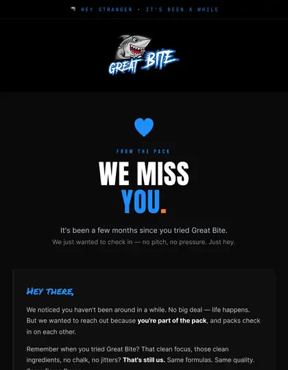
Design the phone layout first, then scale up. Use a single column, readable type, large tap targets, light images and one clear action per section so the email works at arm's length on a small screen.
Why start on mobile
Most marketing emails are opened on a phone, so the mobile layout is the primary design. Desktop becomes the enhancement. See our broader responsive design guide.
Layout rules
- Single column; stack multi-column desktop blocks.
- Comfortable body text, with headings clearly larger.
- Buttons at least thumb-sized with space around them.
- Generous padding so text does not touch screen edges.
Content rules
Lead with the main message and CTA near the top. Short paragraphs, descriptive links and one primary action per block. Cut anything that does not earn its place on a small screen.
Images
Keep images light and crop for narrow screens. Provide alt text and keep key text live; see retina image guidance.
Test on devices
Preview on real phones and in common clients, including dark mode. See our testing checklist.
How EmailDesign helps
This is what our hand-coded builds handle for you: table-based HTML, Outlook fixes, dark mode and tests across 60+ clients before anything is sent. See HTML email development, or pricing for fixed quotes from £95 per email.




Should I still design a desktop version?
Yes, but treat it as the scaled-up version of the mobile layout.
How wide should an email be?
Around 600px is common on desktop; on mobile it should fluidly fill the screen.
Is one column always best?
For marketing emails, usually; multi-column works best in short, stackable blocks.
How big should buttons be?
Big enough to tap comfortably with a thumb, with clear space around them.
Can you build this for us?
Yes. EmailDesign designs and hand-codes emails for UK brands from £95 per email, tested across 60+ clients and set live in your platform.
Ready when you are.
Tell us what you're sending and where — fixed quote within one working day.